Fala gente, tb? Finalmente terminei meu novo portifólio, em Astro, e vou relatar um pouco do processo de desenvolvimento aqui.
Eu ja andava fazendo uns sites com Astro a alguns meses, e vi q presisava de um portifólio pra mim e meus projetos.
Uma das coisas q eu mais gosto no Astro, e a estrutura, q é bem organizada, e por componentes:
.
├── assets
│   ├── fonts
│   │   └── jetbrains-nerd-font.ttf
│   └── images
│       ├── dotfiles.png
│       ├── lofi-tokyo.png
│       └── portfolio.png
├── components
│   ├── About.astro
│   ├── Cards.astro
│   ├── Contact.astro
│   ├── Footer.astro
│   ├── Header.astro
│   ├── Projects
│   │   └── Pro_Cards.astro
│   └── Welcome.astro
├── layouts
│   └── Layout.astro
├── pages
│   ├── index.astro
│   └── projects.astro
└── styles
    └── global.css
A estrutura por componentes ajuda bastante, pouca mt tempo, sem precisar ficar copiando e colando Header pra lá, Footer pra cá. Uma beleza.
Outra coisa q eu gosto bastante e o layout principal do site, onde geralmente é usado em todas as páginas, ele já vem com um padrão no template basico do Astro, mas eu modifico um pouco e fica asssim:
---
export interface Props {
  title: string;
}

const { title } = Astro.props;
---

<!doctype html>
<html lang="en">
  <head>
    <meta charset="UTF-8" />
    <meta name="viewport" content="width=device-width" />
    <link rel="icon" type="image/svg+xml" href="/favicon.svg" />
    <meta name="generator" content={Astro.generator} />
    <title>Henriquehnnm - {title}</title>
  </head>
  <body>
    <slot />
  </body>
</html>

<style>
  html,
  body {
    margin: 0;
    width: 100%;
    height: 100%;
    box-sizing: border-box;
    scroll-behavior: smooth;
  }

  body {
    display: flex;
    flex-direction: column;
    min-height: 100vh;
  }
</style>
Não precisa mecher mt aqui, só o basico mesmo pra ficar legal.
E a forma de criação das páginas e bem legal tbm, ultra simples, eu não costumo colocar conteúdo direto nas páginas, e sim nos componentes, fica bem mais simples de organizar e manter. A index, por exemplo, tá assim:
---
import Layout from "../layouts/Layout.astro";
import "../styles/global.css";

import Header from "../components/Header.astro";
import Welcome from "../components/Welcome.astro";
import About from "../components/About.astro";
import Cards from "../components/Cards.astro";
import Contact from "../components/Contact.astro";
import Footer from "../components/Footer.astro";
---

<Layout title="Home">
  <Header />
  <main>
    <Welcome />
    <About />
    <Cards />
    <Contact />
  </main>
  <Footer />
</Layout>
Tbm costumo criar um css global, q define oq todo mundo vai ter de estilo base, tipo o dots grid no fundo, fonte, variáveis do css. Deixa mais enxuto:
@import url("https://fonts.googleapis.com/css2?family=Bebas+Neue&family=Geist:wght@100..900&display=swap");
@font-face {
  font-family: "NerdFont";
  src: url(../assets/fonts/jetbrains-nerd-font.ttf);
}

* {
  font-family: "Geist", sans-serif;
}

:root {
  /* === Backgrounds === */
  --bg-0: #0b0c0e;
  --bg-1: #131416;
  --bg-2: #1b1c1f;

  /* === Foregrounds === */
  --fg-0: #e8e8ef;
  --fg-1: #b8b8c4;
  --fg-2: #8f8f9b;

  /* === Accents === */
  --accent-blue: #34d8ff;
  --accent-cyan: #67f1d2;
  --accent-mint: #9afad2;
  --accent-purple: #bea5ff;
  --accent-pink: #ffb2e4;
  --accent-lime: #d3fa83;
  --accent-orange: #ffcc91;
  --accent-red: #ff7b8f;
  --accent-magenta: #ff7cf3;

  --border-color: rgba(255, 255, 255, 0.07);
  --shadow-color: rgba(0, 0, 0, 0.45);
  --radius: 12px;
  --transition: 0.2s ease-in-out;
}

body {
  background-color: var(--bg-0);
  color: var(--fg-0);
}

body::before {
  content: "";
  position: fixed;
  top: 0;
  left: 0;
  width: 100vw;
  height: 100vh;
  pointer-events: none;
  inset: 0;
  background-image: radial-gradient(circle, #b6b6c265 1px, transparent 1px);
  background-size: 30px 30px;
  opacity: 0.5;
  z-index: -1;
}

.nerd {
  font-family: "NerdFont";
}

main {
  flex-grow: 1;
}
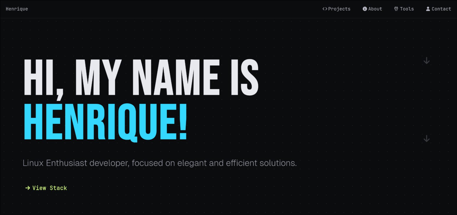
Depois de definir oq todo mundo vai ter em comum, eu já parti direto pro Hero, que tbm e um componente isolado.
---
---
<div class="container">
<section class="hero">
<h1 id="home">Hi, my name is <span>Henrique!</span></h1>
<h2>
Linux Enthusiast developer, focused on elegant and efficient solutions.
</h2>
<a href="#tools" class="nerd"> View Stack</a>
</section>
<div class="element">
<p class="nerd"></p>
<p class="nerd"></p>
</div>
</div>
<style>
.hero {
width: 100%;
min-height: 100vh;
padding: 15vh 5vw;
display: flex;
flex-direction: column;
justify-content: center;
text-align: left;
box-sizing: border-box;
}
.container {
display: flex;
}
p.nerd {
font-size: 30px;
margin: 98px;
padding-bottom: 104px;
color: #8f8f9b55;
margin-top: 100px;
padding-top: 26px;
}
h1 {
font-family: "Bebas Neue", monospace;
font-size: clamp(80px, 12vw, 170px);
font-weight: bold;
line-height: 0.9;
margin: 0;
text-transform: uppercase;
}
h2 {
color: var(--fg-2);
font-size: clamp(20px, 2.5vw, 30px);
font-weight: 300;
max-width: 60ch;
margin-top: 2rem;
margin-bottom: 2.5rem;
line-height: 1.6;
}
span {
font-family: "Bebas Neue";
color: var(--accent-blue);
display: block;
}
a {
color: var(--accent-lime);
font-weight: bold;
text-decoration: none;
display: inline-block;
transition: 0.3s ease-in-out;
font-size: 1.2rem;
padding: 10px;
width: 150px;
}
a:hover {
color: var(--accent-orange);
transform: translateX(5px);
}
@media (max-width: 800px) {
.hero {
padding: 10vh 5vw;
}
h1 {
font-size: 25vw;
}
h2 {
font-size: 5vw;
max-width: 100%;
}
.container {
flex-direction: column;
}
.element {
display: none;
}
}
</style>
Nos componentes, eu estilo apenas eles, de forma isolada, isso facilita bastante, ou seja, agente tem o global, q define oq todos vão ter em comum, e no componente específico, defini oq só ele vai ter. Isso me ajudou bastante no desenvolvimento, deixa as coisas mais claras e isoladas, sem aquelas bagunças de css com 200-400 linhas.
Enfim, já hospedei ele no netlify, e vou comprar um domínio pra ele depois tbm. No mais, acho q não pretendo mais criar meus sites estáticos so com html css e js puro, realmente, o Astro e uma grande mão na roda.
Se quiserem dar uma olhada no site, por enquanto, com o endereço do netlify msm. (Quando mudar o domínio atualiso vcs).
Enfim, tá aqui: